Mercedes Benz Engine in a Second Hand 15-year-old Economic Car

Sreejith Madhavan
Around 20 years ago, one of our customers who formed a startup (currently his organization is part of a global 500 company), during a casual chat, asked me:
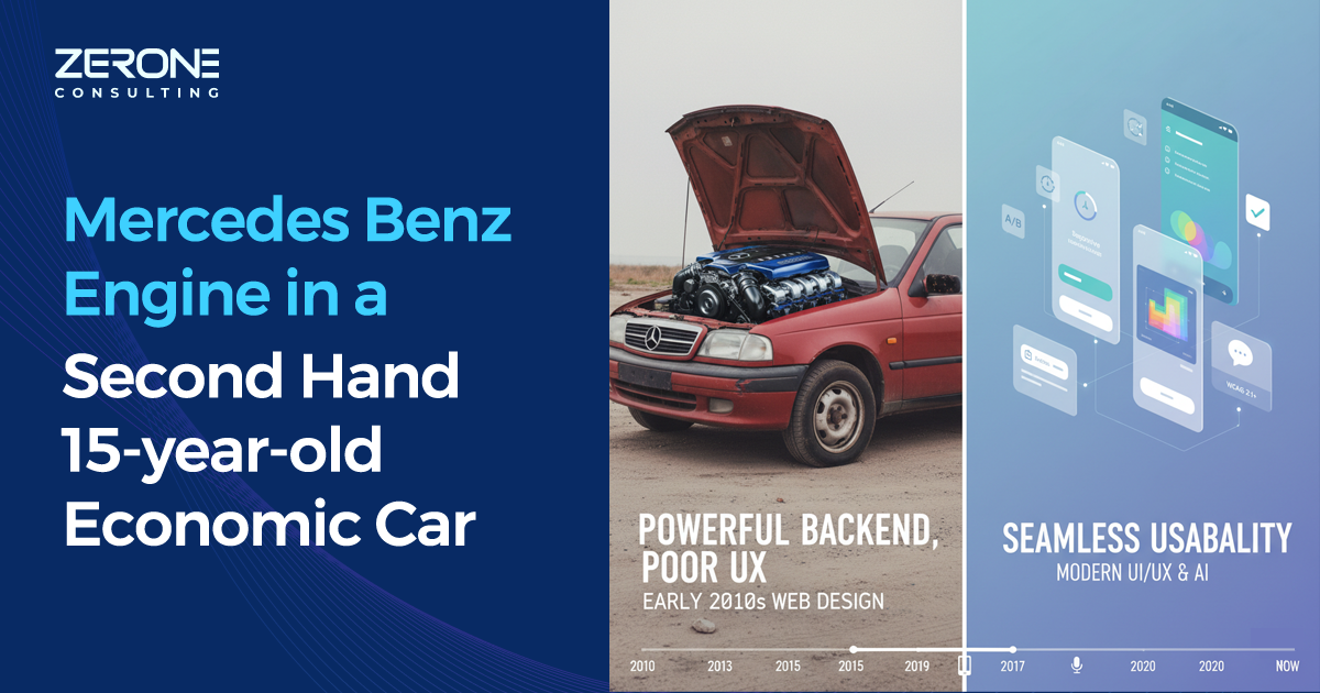
“Would you buy a 15-year-old economic car with a Mercedes Benz engine fitted to it?”
“For what price?” I asked.
“For the price of the Benz engine,” he replied with a smile.
“No, I won’t. Why should I? Even though the car has power, it does not have riding comfort, right? We purchase cars for riding comfort and safety also.”
“Exactly, without a good user experience, no matter how powerful an application's backend is, there is no use. People won’t like it or use it.”
That was an eye opener for us—no matter how much you spend time on architecting your application for security, scalability, database design, and infrastructure, unless the usability of your application is good, no one is going to use it.
In the last 15 years, UI/UX and usability in web and mobile applications have seen tremendous changes. Below are some of the major changes that happened.
In early 2010, designers were trying to copy real-world objects in software designs, like buttons looking like 3D buttons with shadows, scroll bars looking like real-world items. Around 2013, this trend started changing, as minimalistic design came, where more focus started being given to the functions rather than the aesthetics.
By 2015, smartphones dominated the market and mobile data became cheap. This enabled users to access web applications through their mobile devices with different screen sizes. The traditional design failed here as it was initially meant for desktops and laptops. Twitter introduced the Bootstrap CSS library in 2011 for their internal purpose and later released it to the public for usage. This introduced responsive nature for web applications, and the new trend of developing applications that can reshape according to screen size started.
Even though every design was moving forward in the same direction, everyone was using their own design patterns, which made it difficult in maintainability and additional development. Big organizations started standardizing their design systems, which were later released to the public and helped in standardizing design systems. Apple was much ahead of the time, as they always considered their products as customer-centric, and they were following the Apple Human Interface Guidelines from 1987. Some of the others are Google Material Design (2014), IBM Carbon (2015), Atlassian Atlaskit (2018), Microsoft Fluent UI (2017).
With the introduction of AI-driven analytics, analyzing the user flow in an application became a standard testing practice. For this, A/B testing and heatmaps are widely used now. One of the latest trends in design is microinteraction for users, which is achieved by relatively small animations. For example, when a successful transaction happens, an animated tick mark is shown, or when hovering over a button, changing colour to show that it has an action. Voice-based interfaces are also becoming more common, such as Alexa, Siri, or Google Home. Conversational UI such as chatbots, guided wizards, or visual assistants are already widely used.
WCAG 2.1+ standards are a must to follow for accessibility. It is no longer a nice-to-have but mandatory for websites.
Now, while designing the application, importance is given to a lightweight, minimalistic approach where heavy and rich images are avoided. More websites have moved to Single Page Applications (SPA), Server Side Rendering (SSR), lazy loading, and code splitting to improve the performance of the website.
Improvement in usability is no longer an optional feature but a necessity. With the help of AI tools, we can improve the usability of applications significantly.
Read more of our articles on these major blogging platforms: • Medium • Tumblr • Blogger • WordPress.com • Scoop.it • DZone
Featured Resource: Read our latest insights here
We can help!

One Functional Prototype Is Better Than A Thousand Wireframes
#Artificialintelligence
Unlocking The Potential Of Ai In Business Process Outsourcing
#Artificialintelligence

Gold Standard Data: Driving Accuracy In Domain-specific Medical Ai
#Artificialintelligence